
1. A Colourful Comedy Showcase
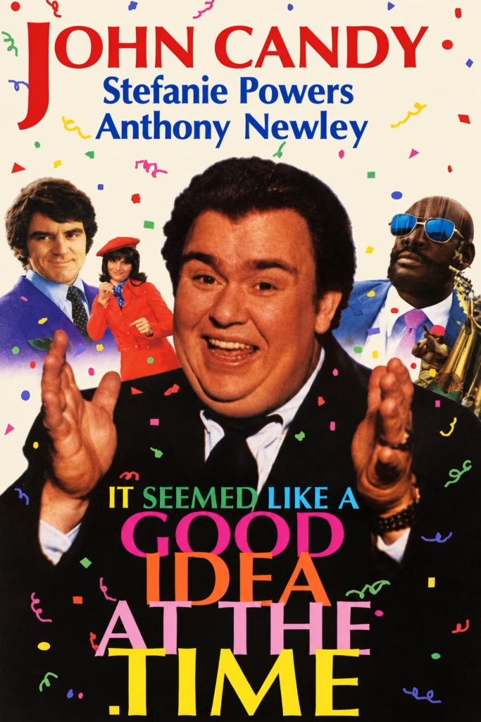
1. Imagery
John Candy dominates the poster with an open-mouthed smile and raised hands. Three smaller characters surround him, while scattered confetti reinforces the comic atmosphere.
2. Composition
The design follows a vertical sequence: cast names at the top, Candy’s portrait in the centre and the stacked title below. The supporting figures frame his face and reinforce his prominence.
3. Colour
A cream background contrasts with the dark lower section. Red, blue, pink, orange and yellow lettering echoes the confetti, creating a lively, festive palette.
4. Title and Typography
The title fills the lower section in large, multicoloured serif lettering, overlapping Candy’s torso. His name dominates the top, giving him greater visual prominence than the other cast members.
5. Symbolism and Tone
The confetti and expressive gestures suggest celebration and comic disorder. The design presents the film through Candy’s humorous persona, promising lighthearted entertainment.
2. A Softer, Romantic Approach
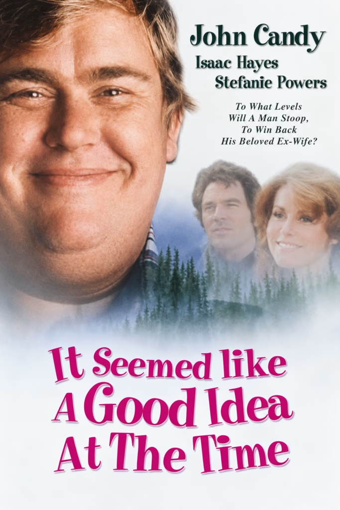
1. Imagery
A smiling John Candy dominates the design, accompanied by two smaller portraits fading into a misty woodland scene. The imagery suggests a gentler, more sentimental mood.
2. Composition
Candy’s close-up anchors the left side, balanced by cast names and supporting portraits on the right. Soft transitions lead the eye towards the large title below.
3. Colour
White, muted blue and forest green create a restrained palette. The vivid pink title introduces warmth and provides the strongest colour contrast.
4. Title and Typography
Large pink serif lettering fills the lower section, clearly separated from the portraits by pale mist. Dark green cast names balance the title, with Candy receiving the greatest prominence.
5. Symbolism and Tone
The mist and woodland imagery suggest nostalgia and emotional distance. The tagline about winning back an ex-wife frames the film as a romantic comedy, while Candy’s smile adds an approachable, humorous touch.
3. Bold Lettering and Comic Intrigue
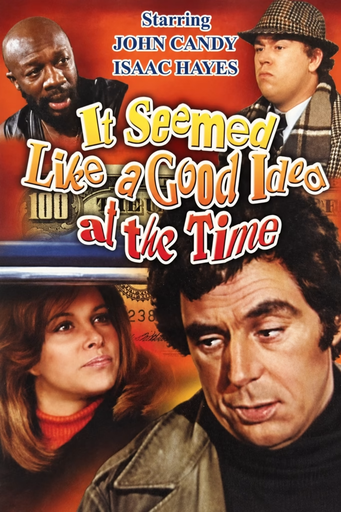
1. Imagery
Four character portraits surround the title, with John Candy and Isaac Hayes above and a larger couple below. Banknote fragments introduce a money-related motif.
2. Composition
The oversized central title connects the upper and lower portraits. Overlapping faces, lettering and background details create a dense montage with little empty space.
3. Colour
Rust red and orange dominate the background, complemented by yellow lettering and warm skin tones. Cream outlines and dark shadows keep the title distinct from the photographs.
4. Title and Typography
Playful serif letters vary in size and angle, giving the title a bouncing rhythm. Its yellow-to-red progression reinforces the warm palette, while the cast names use more formal uppercase lettering.
5. Symbolism and Tone
The banknotes suggest financial schemes, while the contrasting expressions hint at misunderstandings and comic tension. The exuberant typography presents these complications as lighthearted entertainment.
4. Pop Colours and Risqué Comedy
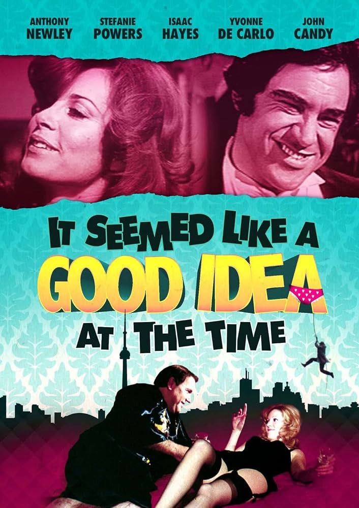
1. Imagery
Two smiling portraits fill the upper strip, while a suggestive scene featuring a reclining woman and a man occupies the bottom. A city skyline and a small dangling figure add visual detail.
2. Composition
The design divides into three horizontal sections: portraits, title and bedroom scene. Torn-paper edges separate the upper photographs, while the skyline links the typography to the lower image.
3. Colour
Turquoise and magenta create a striking contrast, with bright yellow making “GOOD IDEA” the focal point. Black lettering and silhouettes give the vibrant palette structure.
4. Title and Typography
Heavy, irregular lettering gives the title a playful rhythm. “GOOD IDEA” dominates the centre, with pink patterned underwear placed over the final “A” as a visual joke.
5. Symbolism and Tone
The underwear motif and intimate scene suggest sexual mischief and romantic complications. The dangling figure adds slapstick energy, presenting the film as a cheeky, exuberant comedy.