Ghoulies IV (1994): Black Leather, Black Magic and Black Humour
1. Imagery
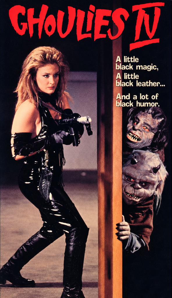
The cover abandons the college setting for a more overtly erotic action-horror image. A blonde woman in glossy black leather stands ready with a weapon, while two Ghoulies hide behind a half-open door. The image treats the creatures as comic intruders, spying on a human heroine rather than dominating the scene.
2. Composition
A tall wooden doorframe splits the artwork vertically. The woman occupies the larger left-hand area, while the two creatures are compressed into a narrow strip on the right. This creates a playful visual contrast: she is active, armed and exposed; they are hidden, static and watching.
3. Colour
The palette is dark and restrained: black leather, deep shadows and brown wood dominate. The vivid red title stands out sharply against the near-black background, while warm flesh tones and the pale slogan add visual focus. The colour scheme is more adult and nocturnal than that of the previous sequels.
4. Title and Typography
The jagged red Ghoulies IV title evokes blood, torn fabric or a rough handwritten warning. The cream-coloured tagline is arranged in short stacked lines, making its rhythm part of the design: “A little black magic, / A little black leather… / And a lot of black humor.” Its casual wording clearly promises a tongue-in-cheek horror film.
5. Symbolism and Tone
The door symbolises a boundary between ordinary space and supernatural mischief, with the Ghoulies literally peering through it. Black leather and the armed heroine introduce an exploitation-action tone, while the monsters’ expressions keep the image comic rather than threatening. The cover sells a knowingly camp mixture of occult horror, sex appeal and low-budget humour.
Ghoulies IV (1994): A Doorway Between Fetish Horror and Creature Comedy
1. Imagery
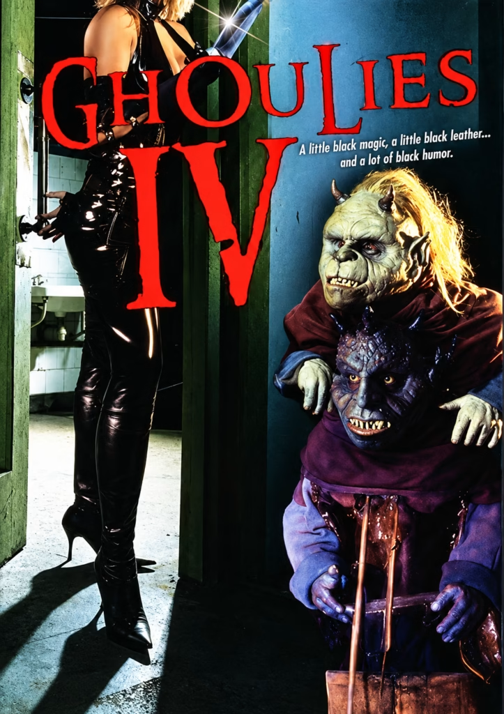
This version uses a more confrontational image: a woman in black leather stands in an open doorway, while two Ghoulies emerge from the darkness beside her. The black costume, high boots and weapon-like prop introduce a fetishised action-horror element, while the monsters retain their deliberately artificial, comic make-up.
2. Composition
The open doorway creates a strong vertical division. The woman is positioned to the left, partly concealed by the door, while the creatures fill the lower-right side. The huge title overlaps both spaces, dominating the centre and linking the human and monster worlds into one deliberately crowded design.
3. Colour
The poster contrasts murky greens and blacks on the left with cold blue tones on the right. Bright red lettering provides the dominant visual shock, while the leather costume reflects points of white light. The result is darker and more stylised than the previous Ghoulies posters.
4. Title and Typography
The title uses large, distressed red letters with uneven edges, giving Ghoulies IV a rough, aggressive horror identity. The small white tagline is set diagonally beside it: “A little black magic, a little black leather… and a lot of black humor.” This wording explicitly defines the film’s hybrid tone.
5. Symbolism and Tone
The doorway represents a threshold between ordinary reality and supernatural intrusion. However, the leather-clad heroine and the smiling monsters prevent the image from becoming genuinely sinister. The poster promises campy, adult-oriented creature horror: occult suggestion, sexualised styling and knowingly cheap black comedy.
Ghoulies IV (1994): A Portrait of the Monsters
1. Imagery
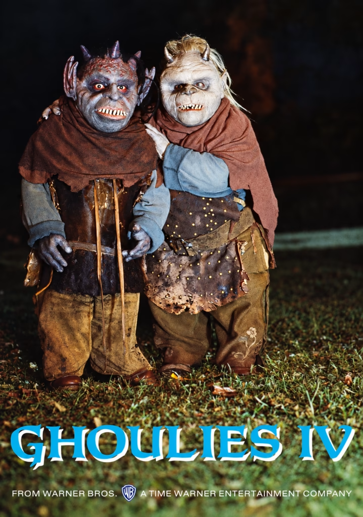
This unusually simple poster presents two Ghoulies standing side by side in a dark outdoor setting. Their mismatched skin colours, small horns, sharp teeth and patched costumes make their practical effects the entire focus. Instead of attacking, they pose almost like mischievous companions caught in a photograph.
2. Composition
The image is built around a centred, full-length double portrait. The creatures occupy the upper and middle sections, while the title sits cleanly across the grass at the bottom. Their close physical contact—one has an arm around the other—creates a surprisingly friendly, character-based image.
3. Colour
Muted browns, greens and faded blues give the poster an earthy, nocturnal feel. The pale faces and teeth stand out against the black background, while the bright cyan title introduces the only strong, modern-looking colour. This contrast makes the title immediately legible without disrupting the photograph.
4. Title and Typography
The white-and-blue serif title echoes the franchise’s familiar Gothic lettering, but it is less aggressive than the red versions used elsewhere. Positioned over the grass, it feels integrated into the scene rather than stamped across it. The small Warner Bros. credit line adds an unexpected touch of studio polish.
5. Symbolism and Tone
By showing the Ghoulies together like a pair of unruly friends, the poster shifts the tone away from horror and towards creature comedy. Their tattered clothes and childlike proportions make them look like fantasy outcasts rather than demons. The result is affectionate and promotional: the monsters themselves are presented as the attraction.
Ghoulies IV: Tras el Amuleto Maldito — Occult Horror Reframed
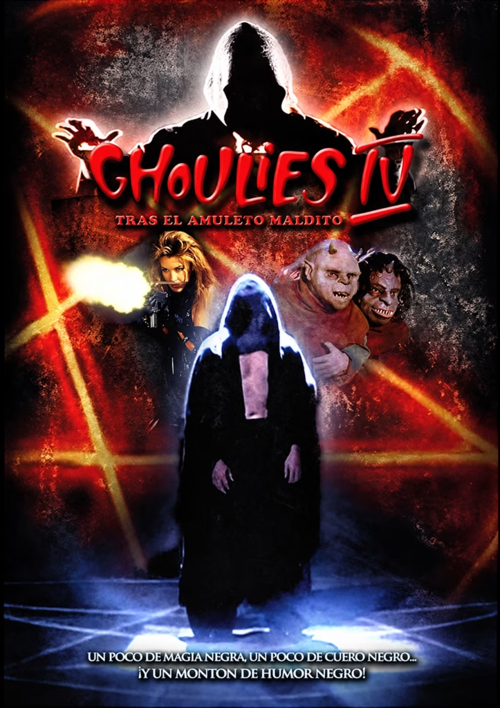
1. Imagery
This Spanish poster presents the sequel as a more explicitly occult horror film. A giant hooded silhouette towers above the title, while a second robed figure stands inside a glowing ritual circle below. Between them, the armed leather-clad heroine and two Ghoulies form a small action-horror tableau.
2. Composition
The artwork follows a strong vertical structure: supernatural master at the top, title and subtitle in the middle, then the heroine, creatures and ritual figure below. The glowing pentagram lines radiate diagonally across the background, connecting the separate figures and giving the poster a far more dramatic, layered composition.
3. Colour
Black, crimson and fiery orange dominate the background, producing a much darker occult atmosphere than the American cover designs. Blue-white light outlines the central robed figure and ritual circle, creating a cold counterpoint to the pentagram’s heat. The vivid red logo completes this infernal palette.
4. Title and Typography
The oversized glossy-red Ghoulies IV logo remains playful and exaggerated, while the subtitle “Tras el amuleto maldito” recasts the film around a cursed-object narrative. The bottom Spanish tagline repeats the franchise formula—black magic, black leather and black humour—linking occult imagery with the series’ campy identity.
5. Symbolism and Tone
The pentagram and hooded figures suggest summoning, possession and demonic control, while the armed heroine introduces an action-oriented counterforce. Yet the two Ghoulies remain visibly comic, preventing the design from becoming fully serious. The tone is a hybrid of supernatural menace and knowingly trashy creature-feature fun.
Ghoulies IV (1994): They’re Back for One Hell of a Party
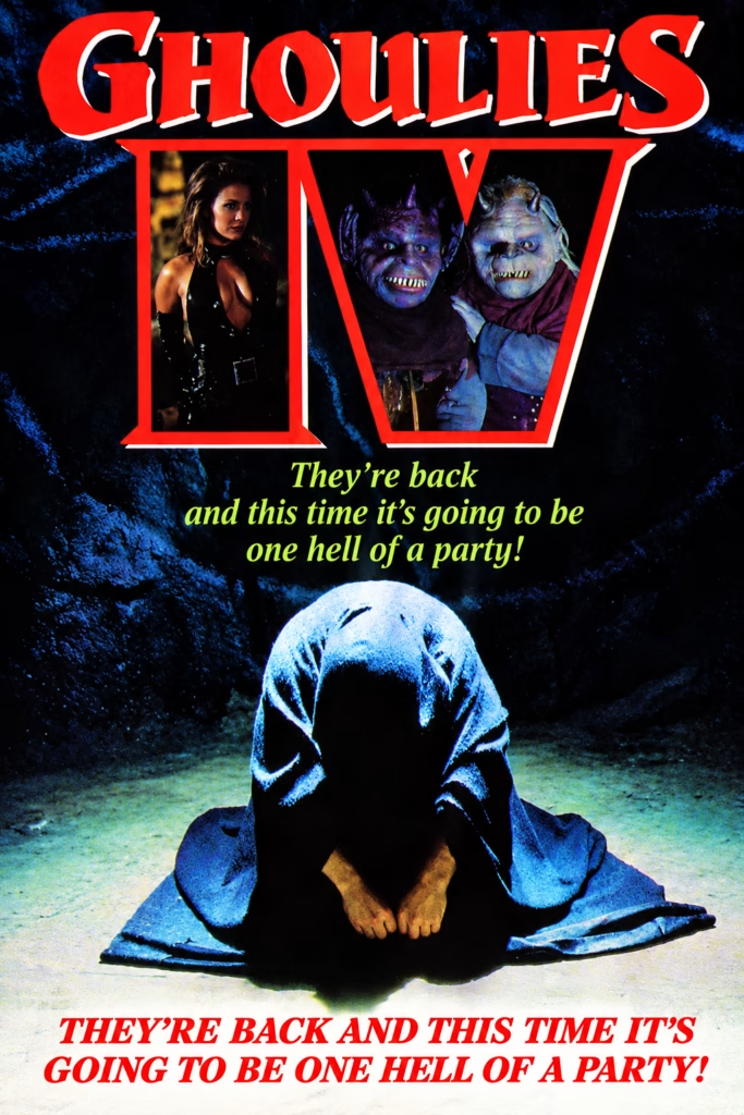
1. Imagery
This cover combines several disconnected images: a leather-clad heroine, two Ghoulies, and a crouching hooded figure in a cavern-like setting. Rather than presenting one narrative scene, it works as a catalogue of the film’s attractions—sex appeal, creature effects and a hint of occult menace.
2. Composition
The design is arranged vertically in distinct sections. The enormous title fills the top, two red frames present the heroine and creatures beneath it, and the hooded figure occupies the lower half. This compartmentalised structure gives the cover the feeling of a video-store collage.
3. Colour
The main palette mixes near-black with cold, electric blues and bright red. Blue light isolates the hooded figure against the cave background, while the red typography and frame lines create forceful visual punctuation. Lime-green text adds a pulpy, slightly comic contrast.
4. Title and Typography
Ghoulies IV appears in massive distressed red letters with white shadowing, giving the title a strong VHS-era horror identity. The Roman numeral is integrated into the logo rather than treated as a small sequel marker. Below, the italic green tagline promises that the film will be “one hell of a party,” shifting the tone from fear towards fun.
5. Symbolism and Tone
The hooded figure evokes possession or ritual, while the dark cave and red framing suggest supernatural danger. However, the smiling monsters and playful wording prevent the cover from becoming solemn. The tone is exaggerated, lurid and knowingly camp: horror imagery packaged as a rowdy creature-feature party.