
Ghoulies III: Ghoulies Go to College (1991): Graduation Day Goes Grotesque
1. Imagery
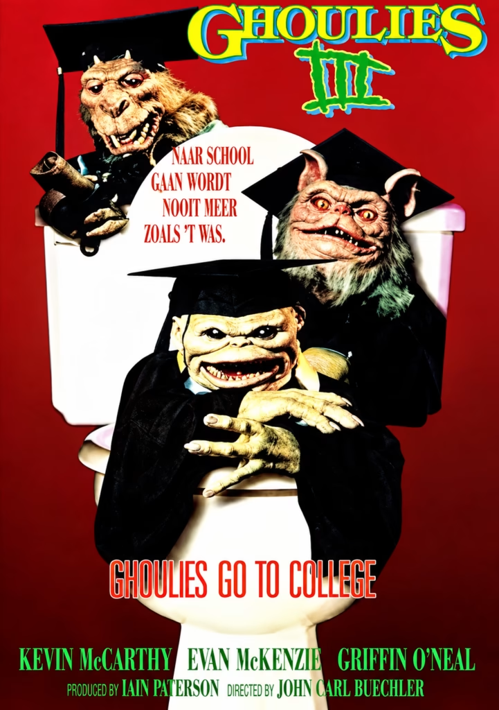
Three Ghoulies wear graduation caps and gowns while posing around a toilet, a visual joke inherited from the previous films. Their exaggerated ears, claws, teeth and wrinkled faces make them comic monsters rather than frightening villains. The diploma and academic clothing turn college life into a deliberately absurd horror setting.
2. Composition
The creatures form a compact triangular arrangement around the toilet. The largest figure sits at the top left, the second dominates the right, and the smallest reaches forward from the centre. This layered grouping gives each monster a distinct role while keeping the title clearly visible above.
3. Colour
The intense red background gives the poster immediate energy and a slightly lurid B-movie feel. The white toilet provides a bright central contrast, while black graduation gowns frame the creatures’ yellow, pink and greenish make-up. The neon-like title colours add a cartoonish, playful finish.
4. Title and Typography
The Ghoulies III logo is bright yellow-green with blue and red shadows, making it far more colourful and comic-book-like than the earlier titles. The subtitle, “Ghoulies Go to College,” appears in tall red letters on the toilet base. Together, the typography openly advertises a broad horror-comedy rather than a serious sequel.
5. Symbolism and Tone
Graduation normally represents achievement and maturity, but the poster turns it into a joke about chaos invading institutional life. The toilet remains a recurring symbol of bad taste and domestic disruption. Its tone is knowingly silly: a campus comedy crossed with creature-feature horror, with no attempt to hide its absurd premise.
Ghoulies III: Ghoulies Go to College (1991): Campus Comedy, Creature Chaos and Sexploitation
1. Imagery
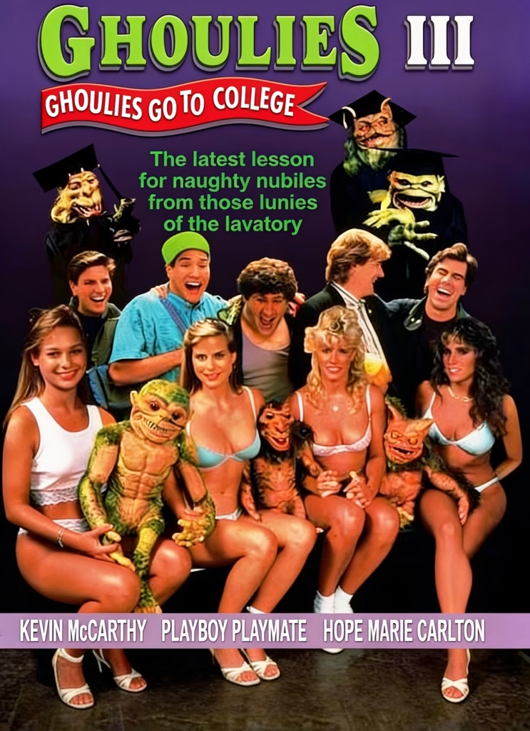
The poster assembles the Ghoulies, a group of smiling college students and three women in lingerie into a single crowded promotional image. The miniature creatures sit on laps or stand alongside the cast, while their larger, robed versions loom above. This makes the monsters seem like unruly mascots rather than genuine threats.
2. Composition
The layout is divided into three tiers: title and banner at the top, the ensemble cast in the centre, and the credits at the bottom. The human group forms a broad pyramid, while the academic Ghoulies frame it from above. The composition prioritises faces, bodies and comic chaos over narrative atmosphere.
3. Colour
A dark purple-to-black background gives the poster some horror-film atmosphere, but the bright green logo, red banner and turquoise clothing keep it lively. The lingerie and warm skin tones draw attention to the foreground figures, making the image resemble a rowdy college-comedy advertisement.
4. Title and Typography
The large green Ghoulies III logo repeats the sequel’s cartoonish visual identity. Beneath it, the red ribbon-shaped subtitle, “Ghoulies Go to College,” makes the premise immediately clear. The central green tagline uses playful rhyming—“naughty nubiles” and “lunies of the lavatory”—to turn the toilet-based joke into the poster’s comic selling point.
5. Symbolism and Tone
The graduation caps parody academic respectability, while the Ghoulies’ presence suggests that campus life is about to become childish and unruly. The use of lingerie-clad women and the credit “Playboy Playmate Hope Marie Carlton” positions the film within low-budget sexploitation comedy as much as horror. Its tone is knowingly juvenile, selling college pranks, monsters and sexualised humour rather than suspense.