Ghoulies II (1988): The Return of Toilet Terror
1. Imagery
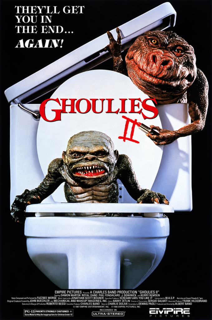
The poster revisits the original film’s most memorable gag: a Ghoulie climbing out of a toilet. This time, a second creature leans over the cistern, holding a pair of scissors and giving the image a more crowded, mischievous energy. The clean white porcelain makes the monsters’ wet, reptilian textures especially striking.
2. Composition
The toilet dominates the centre of the design, creating a simple and instantly readable image. One Ghoulie emerges from the bowl while the other occupies the upper-right corner, breaking the symmetry. The raised lid forms a strong diagonal that guides the eye from the slogan to the creatures and title.
3. Colour
The poster relies on a restrained palette of black, white, grey and red. The black background isolates the toilet like a stage prop, while the red title becomes the main visual accent. Warm brown and green creature tones prevent the image from feeling too clinical.
4. Title and Typography
The red Ghoulies logo remains central, now accompanied by a rough, hand-drawn Roman numeral II. Its irregular strokes make the sequel number look scratched or painted in blood. The white slogan uses a dramatic serif typeface and promises a deliberately familiar return: “They’ll get you in the end… again!”
5. Symbolism and Tone
Once again, the toilet turns an ordinary domestic object into the site of supernatural invasion. The scissors add a small threat, but the image is primarily comic rather than frightening. Its tone is knowingly crude and playful, confidently selling the sequel as a repeat dose of creature-feature bad taste.
Ghoulies II (1988): Four Faces of Creature Horror
1. Imagery
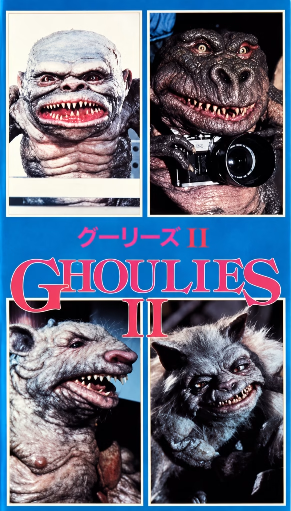
The poster presents the four Ghoulies as individual creatures, each framed like a separate character portrait. The close-ups stress their practical make-up: wrinkled skin, animal features, sharp teeth and exaggerated expressions. One creature holding a camera adds a comic, self-aware touch.
2. Composition
The four photographs form a neat grid around the central title. This simple structure makes the creatures the poster’s main attraction, inviting the viewer to inspect each design separately. Rather than depicting a scene from the film, it functions almost like a monster showcase.
3. Colour
A bright cyan-blue background unifies the separate photographs and gives the poster an energetic, commercial look. The hot-pink title and Japanese lettering provide strong contrast, while the muted browns, greys and blacks of the creatures keep the photographs visually dominant.
4. Title and Typography
The large pink serif title is elegant but deliberately oversized, stretching across the middle of the design. Its bright colour contrasts with the grotesque creature portraits, balancing horror with an accessible, almost pop-art sensibility. The Japanese title above confirms this as a localised promotional design.
5. Symbolism and Tone
By displaying the monsters as a collection, the poster turns them into the film’s brand identity. They are not presented as mysterious threats but as recognisable, characterful attractions. The tone is playful and creature-focused: a colourful invitation to enjoy the sequel’s practical effects and grotesque humour