
Amityville 3-D: theatrical poster
Imagery
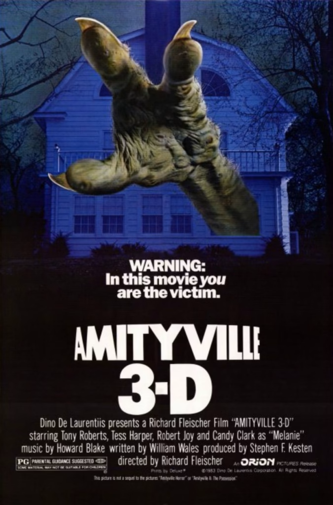
The poster shows a huge, clawed hand thrusting out toward the viewer, with a blue-lit house behind it. The hand appears to burst out of the image itself, turning the poster into a simple visual demonstration of the film’s 3-D gimmick. Its exaggerated scale makes the house feel small and vulnerable.
Composition
The hand dominates the upper half of the design, while the house provides a clear setting behind it. The image’s strong forward thrust draws the eye down to the warning and then to the oversized title. The lower half is mostly black, giving the text room to stand out and creating a visual shift from the detailed image to the bold typography.
Colour
Cold blues bathe the house and bare trees, suggesting a dark, ominous night. The hand’s muddy yellow-brown tones contrast with that blue palette, making it look unnatural and disturbing. White lettering cuts sharply through the dark background.
Title and Typography
“AMITYVILLE” is set in tall, angular capitals, while “3-D” is much larger and heavier beneath it. The scale and placement make the format part of the title’s main attraction. The compact warning—“In this movie you are the victim”—sits between the image and title, directly addressing the audience.
Symbolism and Tone
The reaching hand turns the cinema screen into a threat: the danger seems to cross the boundary between the film and the viewer. The warning reinforces that idea and gives the poster a knowingly sensational tone. Overall, it sells Amityville 3-D as a playful, high-impact haunted-house spectacle, with the 3-D effect itself presented as part of the horror.
Amityville 3-D: Glowing halo and haunted house
Imagery
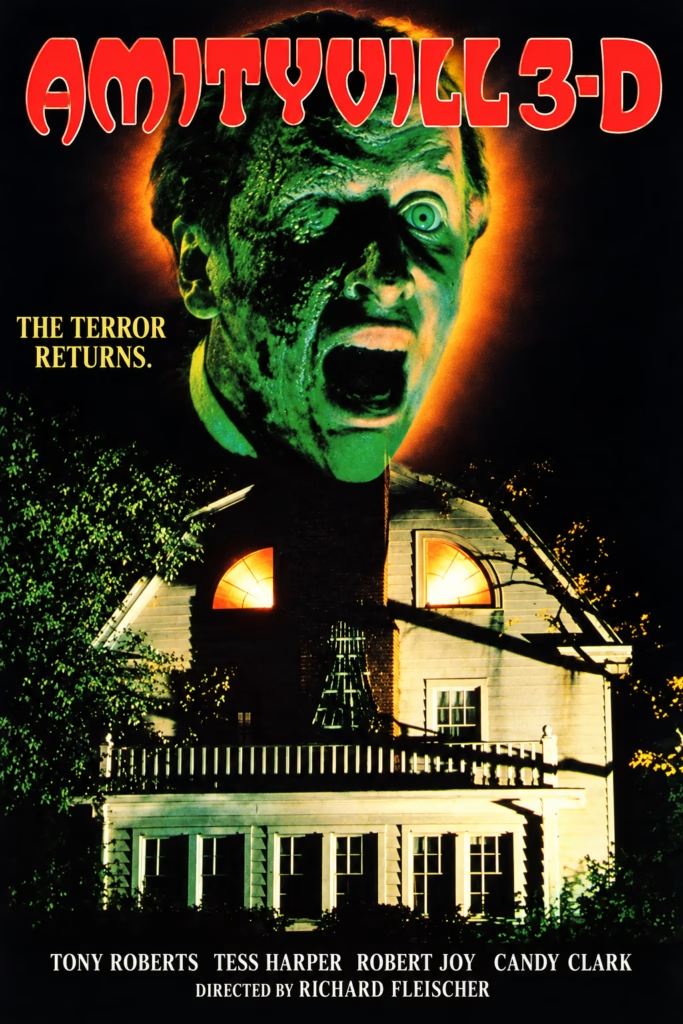
A huge, green-lit face looms over the Amityville house. Its open mouth and fixed stare make it feel like a supernatural presence watching the home. The orange halo separates the face from the darkness and gives it an unnatural, almost infernal glow.
Composition
The face fills the upper centre, while the house anchors the lower half. The large red title spans the top, and the tagline sits to the left of the face. The cast and director credits form a narrow block at the bottom, keeping the house as the main visual focus.
Colour
The intense green face contrasts with the fiery orange glow and the house’s pale yellow light. Black surrounds the scene, deepening the shadows and making the colours feel more vivid. The red title adds another sharp accent and stands out immediately.
Title and Typography
“AMITYVILLE 3-D” uses large, irregular red lettering with a pale outline, echoing the original poster’s distinctive title treatment. The yellow serif tagline, “THE TERROR RETURNS,” is smaller but easy to read against the dark background. White credits keep the cast and director legible without competing with the image.
Symbolism and Tone
The enormous face suggests that the house is under the influence of a malevolent force. The glowing windows make the home feel inhabited, while the surrounding darkness isolates it. Together, the imagery and dramatic colour give the poster a vivid, high-impact supernatural horror tone.
Amityville 3-D: The haunted house
1. Imagery
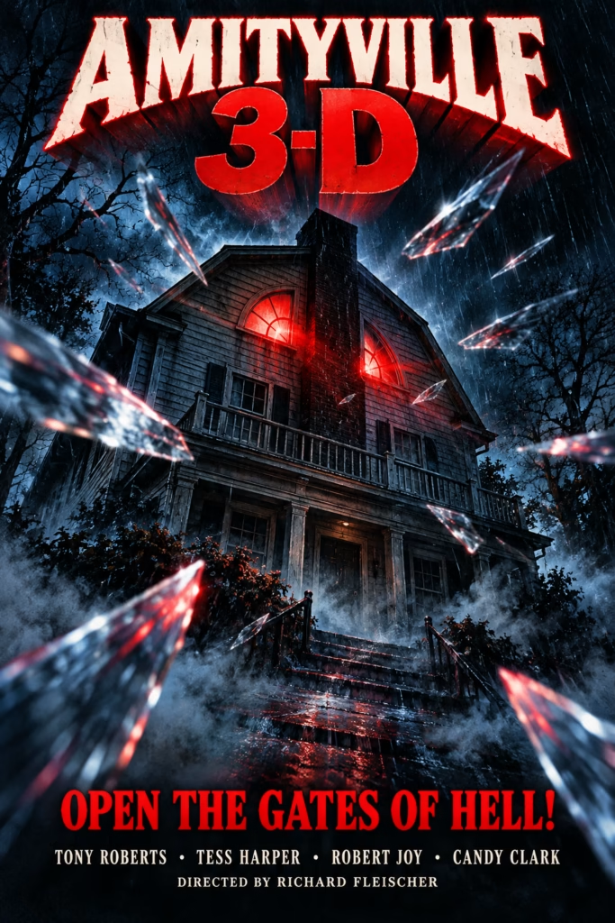
The haunted house is the central subject, with red-lit windows suggesting something sinister inside. Glass-like shards shoot toward the viewer, hinting at the film’s 3-D spectacle.
2. Composition
The title dominates the top, the house fills the centre, and the tagline and credits sit at the bottom. The shards lead the eye inward toward the house and create a strong sense of depth.
3. Colour and Tone
Cold blue shadows contrast with the red windows and title. This gives the poster a dramatic, high-contrast horror look and a pulpy 1980s feel.
4. Typography and Symbolism
The distressed title lettering makes the film name immediately prominent; “3-D” is especially bold. The tagline, “OPEN THE GATES OF HELL!”, frames the house as a portal to danger, while the glass fragments make that danger seem to break into the viewer’s space.
Amityville III: The Demon
1. Imagery
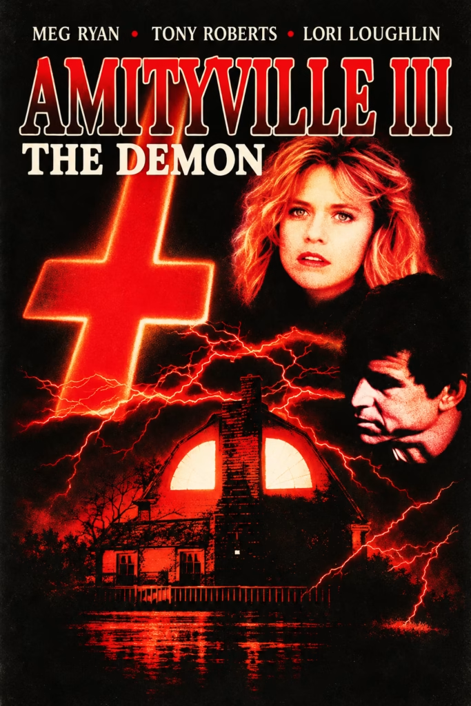
The glowing red cross, haunted house and floating portraits build a clear supernatural-horror image. The woman’s anxious expression draws attention, while the shadowed man adds a second, more threatening presence.
2.Composition
The large title fills the upper section. The cross balances the portraits, and branching red energy guides the eye down to the house. The dark background keeps the layered elements distinct.
3. Colour and Typography
Red and orange dominate, set against black and ivory. The contrast gives the poster a fiery, ominous feel. Large outlined lettering makes “AMITYVILLE III” the focal point, with “THE DEMON” directly beneath it.
4. Symbolism and Tone
The cross suggests religious imagery, while the glowing windows and spreading energy imply that the house is the source of the supernatural threat. The result is a dramatic, vintage-style horror poster with a strong sense of foreboding.
Amityville III: The Thriller
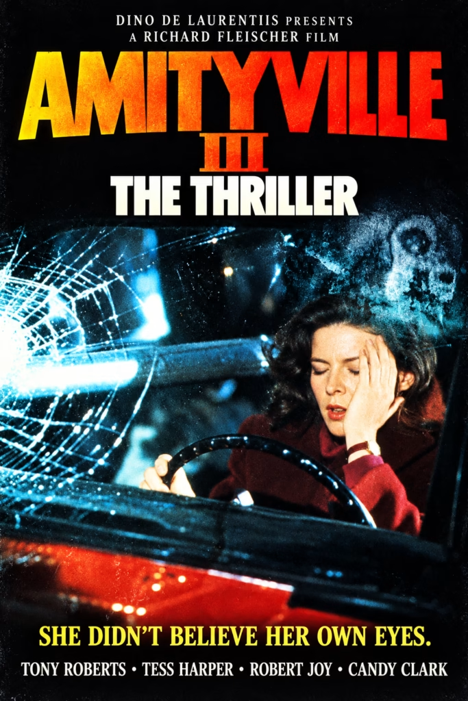
1. Imagery
The frightened woman behind the wheel is the focal point. The shattered windshield and spectral face in the glass suggest that the danger may be both outside the car and in her mind.
2. Composition
The title fills the top, the car scene occupies the centre, and the tagline and cast credits sit at the bottom. This creates a clear reading order and gives the central image room to build tension.
3. Colour and Typography
The orange-to-red title stands out against the black background. Cold cyan light across the broken glass contrasts with the warmer reds in the car and the woman’s clothing. The large, bold type makes the title easy to read.
4. Symbolism and Tone
The fractured glass serves as a visual sign of danger and distorted perception, echoing the tagline, “She didn’t believe her own eyes.” The faint face in the glass adds a supernatural edge. The result is a vivid, dramatic horror-thriller poster with a polished vintage feel.
Amityville 3: mounstruous face
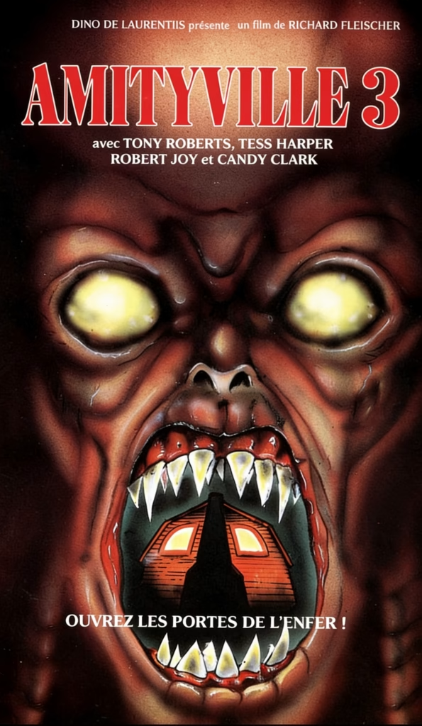
1. Imagery
A monstrous face fills almost the entire poster, its glowing yellow eyes staring directly at the viewer. The open mouth contains the Amityville house, turning the building into something swallowed by—or emerging from—the creature.
2. Composition
The title and credits sit across the top, leaving the face to dominate the image. The mouth draws the eye downward to the house and the French tagline at the bottom: “Open the gates of hell!” The tight framing makes the image feel confrontational and claustrophobic.
3. Colour
Black and deep reddish-brown create a dark, oppressive background. The bright eyes, sharp white teeth and orange-lit house stand out as points of menace.
4. Typography and Tone
The large red title with a pale outline is easy to distinguish from the artwork. The tagline reinforces the poster’s infernal imagery. Overall, the design is lurid and deliberately grotesque, presenting the house as a source of monstrous evil.