
Amityville II: The Possession (1982): Terror Within the Family
1. Imagery
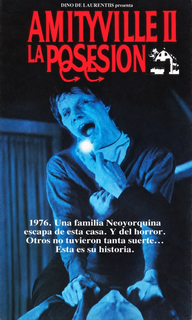
The poster captures a moment of physical and spiritual distress: a young man screams as a bright light erupts from his chest, while another figure is pinned beneath him. The image makes possession visible through the body, transforming domestic violence into a supernatural attack.
2. Composition
The large red title dominates the upper third, leaving the blue-tinted scene to occupy the rest of the poster. The screaming man’s diagonal pose drives the eye downward towards the victim below. This creates a disturbing sense of collapse, as though the horror is literally falling into the family home.
3. Colour
The design relies on a stark contrast between red, black and electric blue. Red signals possession, blood and danger; blue gives the figures a cold, corpse-like quality. The near-black background isolates the violent scene and makes the burst of white light especially unnerving.
4. Title and Typography
The red typography is large, heavy and theatrical. Amityville II is formal and imposing, while La posesión uses a more distorted, flowing treatment that appears unstable or corrupted. The small white house icon anchors the sequel within the series while the title foregrounds its new emphasis on demonic possession.
5. Symbolism and Tone
The central light suggests an evil force emerging from within rather than attacking from outside. The tagline frames the story as the aftermath of the original Amityville nightmare: one family escaped, but another was not so fortunate. The tone is darker and more violent than the first film, shifting from haunted-house dread to family-based possession horror.
Amityville II: The Possession (1982): The House’s Original Evil
1. Imagery
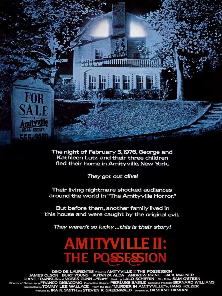
The poster’s central image is the Amityville house at night, its attic windows glowing like eyes. A prominent “For Sale” sign turns the familiar home into a commercial trap, while the empty lawn and dark trees make the setting feel isolated and hostile.
2. Composition
The design is split into two halves. The house occupies the upper section, while a large block of story text leads the eye down to the red title and credits. This poster functions almost like a prologue, using text as strongly as image to establish the film’s connection to the first Amityville Horror.
3. Colour
Cold blue dominates the night scene, giving the house a spectral, corpse-like appearance. Black surrounds both the image and text, creating a void around the building. The red title at the bottom breaks this monochrome scheme and signals the more violent, possession-focused direction of the sequel.
4. Title and Typography
The title is set in bold red serif lettering, with The Possession given a more distorted and flowing treatment. Its placement after the long explanatory text makes it feel like the final reveal of a dark story. The classic lettering links the sequel to the original while signalling a new emphasis on demonic control.
5. Symbolism and Tone
The “For Sale” sign represents the false promise of a new home: the property appears available, but its history remains inescapable. The text frames the Lutz family as survivors and introduces an earlier family as the real victims of the house’s “original evil.” The tone is sombre, fatalistic and strongly rooted in cursed-house mythology.
Amityville II: The Possession (1982): Evil Above and Within the House
1. Imagery
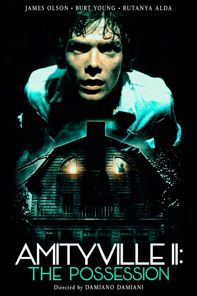
The poster merges a haunted-house image with a close-up of a frightened young man. His face appears to rise from the roofline, making him seem both a victim of the house and an extension of its evil. The glowing attic windows and shadowy silhouette suggest an unseen presence already inside.
2. Composition
The design is built on a strict central axis: the man’s face, the chimney and the house façade align vertically. This symmetry gives the image an oppressive, ritual-like order. The title at the bottom stabilises the composition while the actor names frame the face at the top.
3. Colour
Black dominates the poster, allowing icy teal-green light to define the figure and house. This cold palette makes the building look damp, decayed and supernatural. Small warm glows in the attic windows provide the only hint of life, but they read as threatening rather than welcoming.
4. Title and Typography
The thin white Amityville II: lettering feels modern and clinical, while The Possession appears in luminous teal. This distinction makes the subtitle the emotional key to the image: the sequel is not merely another haunted-house story, but one about evil taking hold of a person.
5. Symbolism and Tone
The fusion of face and house suggests that the real curse is internal as well as architectural. The central chimney divides the façade like a dark scar, while the attic silhouette hints at a hidden force controlling events. The tone is bleak, intimate and psychological, presenting possession as a collapse of identity.
Amityville II: The Possession (1982): Seen Through the Skull
1. Imagery
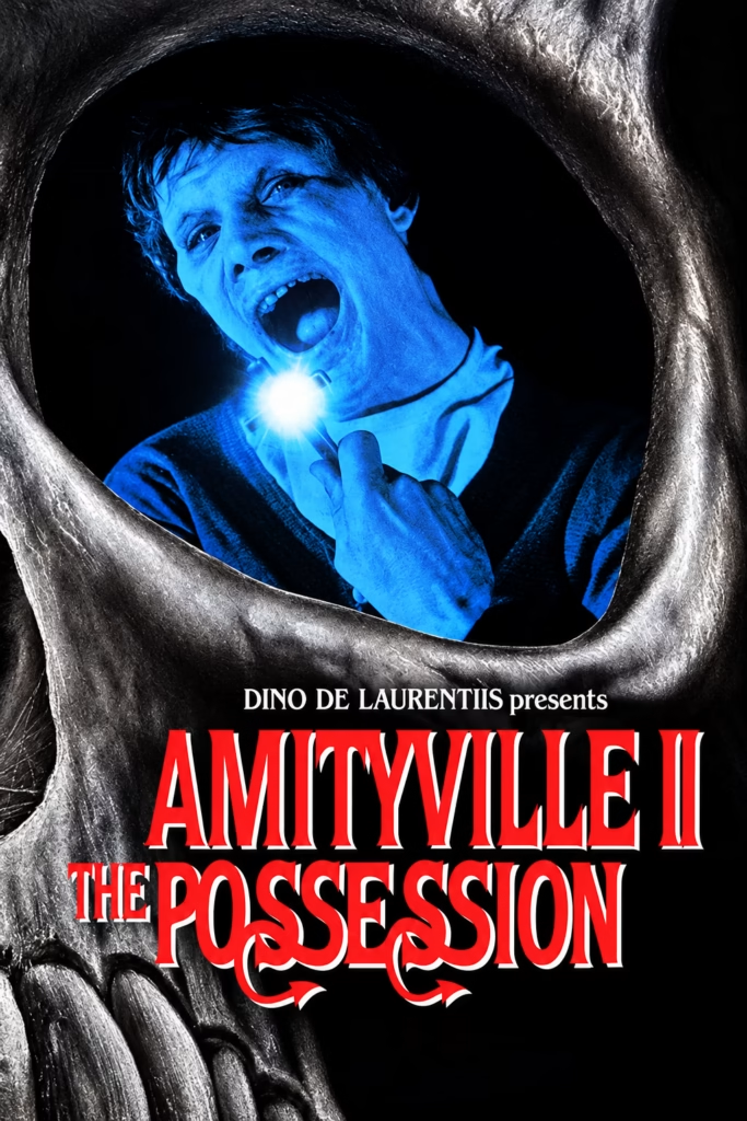
The poster presents a screaming young man through a huge skull-like opening. A burst of light at his throat suggests an internal force trying to emerge, while the surrounding bone structure turns the image into a vision of death, possession and entrapment.
2. Composition
The skull frame dominates the entire image, enclosing the man in an irregular eye socket. This creates a literal point-of-view effect: the audience seems to be looking through death itself. The title fills the lower section, anchored by the skull’s jaw and giving the design an unusually forceful vertical rhythm.
3. Colour
Electric blue isolates the figure from the black background, making him appear frozen, spectral and unnatural. The silver-grey bone frame adds a decayed metallic texture, while the red-and-white title introduces a violent contrast. The palette is colder and more graphic than a conventional haunted-house poster.
4. Title and Typography
The title uses tall red serif lettering with a hard white shadow, producing a classic horror-poster look. The Possession is larger and more distorted than the series name, emphasising the film’s central idea. Its curling forms suggest instability, as though the lettering itself were infected or transformed.
5. Symbolism and Tone
The skull signals mortality and demonic power, while the man’s glowing throat suggests possession as an invasion of the body. Rather than showing the Amityville house, the poster locates the horror inside a person. The tone is intense, claustrophobic and supernatural, promising a darker sequel focused on bodily and spiritual corruption.
Amityville II: The Possession (1982): A House Surrounded by the Dead
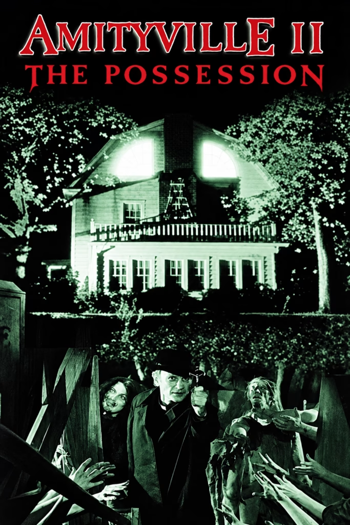
1. Imagery
The poster combines the glowing Amityville house with a graveyard-like scene below. A priest raises a crucifix between distressed figures, while numerous pale hands reach into the image from every side. The house’s bright attic windows make the building appear alert and predatory.
2. Composition
The poster is divided into two stacked zones. The house dominates the upper half, framed symmetrically by trees, while the lower section becomes a crowded struggle between the priest, victims and reaching hands. This arrangement makes the house seem to preside over the chaos below.
3. Colour
A sickly green-white glow is set against near-black shadows. The limited palette gives the image a night-vision or decayed-photograph quality, making the house and figures seem simultaneously illuminated and lifeless. Red typography at the top provides the only warm, violent contrast.
4. Title and Typography
The title is split across two lines: Amityville II in white-edged red serif lettering and The Possession in a flatter, darker red style. This creates a clear hierarchy, with the sequel title naming the franchise and the subtitle defining its new threat. The large scale makes the logo feel dominant and theatrical.
5. Symbolism and Tone
The reaching hands suggest that the house is not merely haunted but surrounded by an inescapable force of death and possession. The priest’s cross introduces a direct religious confrontation, while the glowing house remains the apparent origin of the evil. The tone is more overtly supernatural and apocalyptic than domestic
Amityville II: The Possession (1982): A Bloodied Priest Confronts the Evil of Amityville
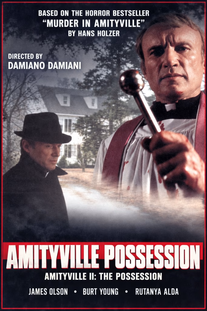
1. Imagery
The poster layers a stern priest in the foreground over a shadowy man and the Amityville house. The priest’s direct stare and raised silver object create an immediate sense of threat. The figures overlap the house, suggesting that the haunting reaches into both the home and the people connected to it.
2. Composition
The priest dominates the right side, balanced by the dark figure on the left. The house sits between them in the background, softened by mist. The title anchors the bottom in a wide red band, while the English credits above and below it keep the layout readable.
3. Colour
Muted greys and blacks create a gloomy, almost dreamlike atmosphere. The pale house emerges from the haze, while the thin red border and title band add a strong horror accent. The restrained palette keeps attention on the faces and the haunted setting.
4. Title and Typography
The large white capitals in “AMITYVILLE POSSESSION” are designed for strong impact and easy reading. The subtitle, “AMITYVILLE II: THE POSSESSION,” identifies the film clearly. The translated text at the top and the cast credits preserve the poster’s original hierarchy. The MTC logo has been removed.
5. Symbolism and Tone
The house remains the centre of the mystery, while the priest and shadowy figure suggest a struggle between spiritual authority and possession. The fog blurs the boundary between the real and supernatural, giving the poster a sombre, unsettling tone.
Amityville II: The Possession (1982): A Family Under the House’s Shadow
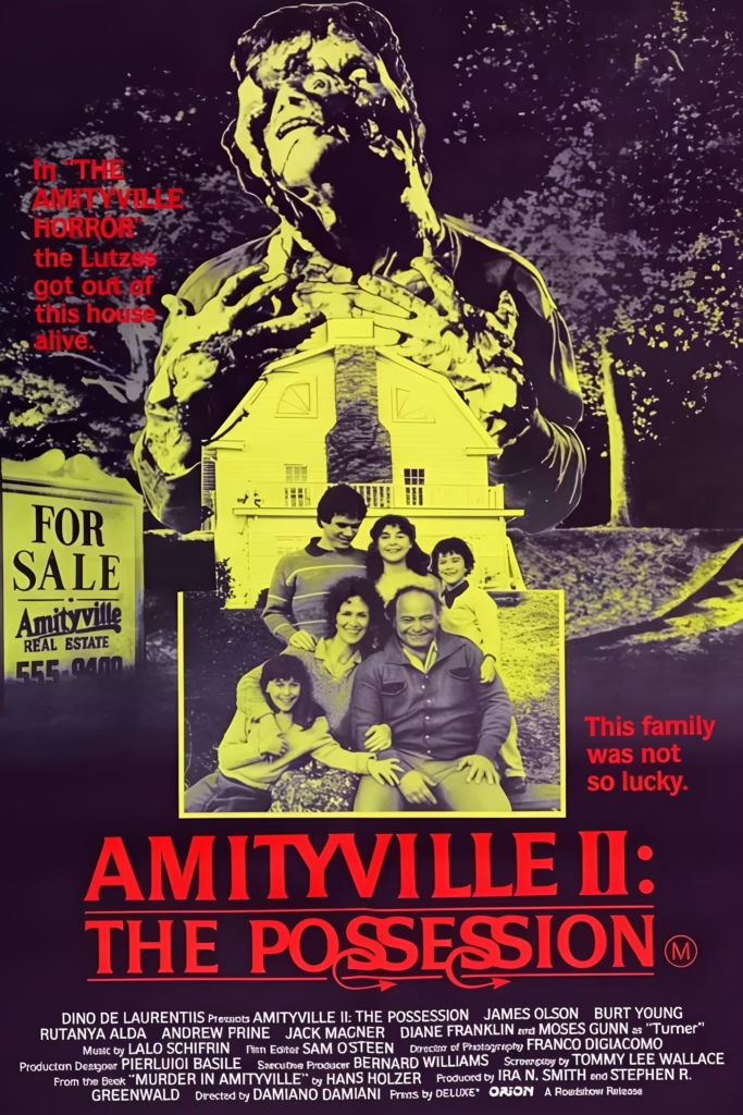
1. Imagery
A giant screaming figure looms over the Amityville house and a family portrait, making possession appear as a force that physically dominates the household. The “For Sale” sign recalls the original film, while the cheerful family image becomes ominous beneath the towering figure.
2. Composition
The image uses a clear stacked structure: the possessed figure above, the house and family in the middle, and the title and credits below. This makes the family seem caught between the property and the supernatural force controlling it.
3. Colour
Acid yellow-green highlights the central figure, house and family, creating an unhealthy, supernatural glow. Dark purple-black fills the background, while red text introduces danger and violence. The palette feels closer to exploitation horror than the restrained blue tones of the first film.
4. Title and Typography
The large red title is direct and forceful. The Possession uses distorted, curling letterforms that look unstable and corrupted, visually reinforcing the sequel’s emphasis on demonic control. The red side captions add a tabloid-like sense of tragic revelation.
5. Symbolism and Tone
The house is no longer merely haunted: it is presented as the centre of a curse that consumes an entire family. The oversized figure suggests that evil becomes internal as well as domestic. The tone is melodramatic and lurid, promising a more violent, possession-focused sequel.