
The Amityville Horror (1979) — Original Theatrical Poster
1. Imagery
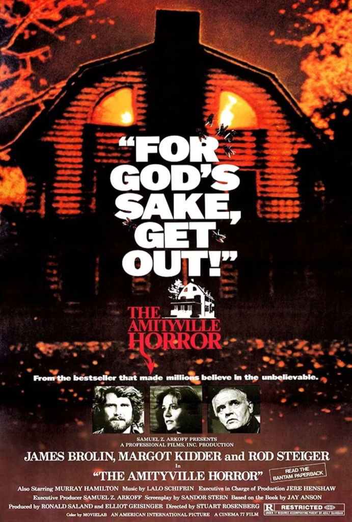
The poster centres on the Amityville house, its distinctive upper windows glowing like a pair of watchful eyes. The image is deliberately grainy and shadowed, giving the building an ominous, almost living presence. Small figures and fragments of light around the windows add unease without revealing a specific threat.
2. Composition
The house fills nearly the entire frame, making it impossible to look past. Its symmetrical façade draws the eye towards the windows, then down to the bold central quotation: “For God’s sake, get out!” The film title sits below, followed by the cast portraits and production credits, creating a clear path from the horror image to the film’s identity.
3.Colour
A restricted palette of black, fiery orange, red and white gives the poster its striking impact. The orange glow suggests fire, danger and supernatural activity, while the deep shadows make the house feel vast and concealed. White lettering cuts sharply through the darkness, and the red title reinforces the sense of alarm.
4.Title and Typography
The main quotation is set in oversized, heavy white capitals. Its tight, irregular arrangement makes it feel urgent, as though the warning is breaking through the image. The film title uses red serif lettering, a more traditional style that gives it a stark, almost formal contrast. Together, the two treatments make the warning and the title immediately memorable.
5. Symbolism and Tone
The glowing windows turn the house into a watchful presence, suggesting that the danger comes from within. The plea to “get out” frames the story as a desperate escape, while the bestseller tagline connects the film’s horror to claims presented as real. The result is a poster that feels threatening, sensational and rooted in the idea that an ordinary home can become a place of terror.
The Amityville Horror (1979): A House Consumed by Fear
1. Imagery
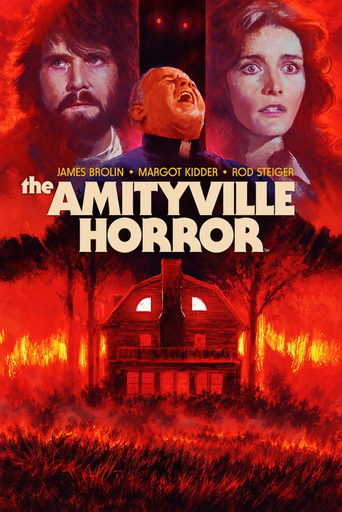
The poster combines three frightened human faces with the iconic Amityville house, shown below amid flames and darkness. The central screaming priest connects the family drama to religious horror, while the house’s glowing attic windows give the building an almost watchful expression.
2. Composition
The design follows a clear vertical structure. The three faces dominate the upper section, the title forms a heavy central block, and the house becomes the focal point below. The downward movement—from human fear to the burning home—suggests that the source of the terror lies within the domestic space.
3. Colour
Red and orange overwhelm the poster, creating an atmosphere of fire, violence and supernatural danger. Black trees and shadows cut through the heat, while the cream title offers sharp contrast. The limited palette makes the image feel like a nightmare illuminated by flames.
4. Title and Typography
The title uses huge cream-coloured serif letters with a heavy, monumental presence. AMITYVILLE is especially large, giving the location itself the status of a monster. Its conventional, almost historical lettering contrasts with the violent red background, lending the story an air of dreadful legend.
5. Symbolism and Tone
The house symbolises the corruption of family safety: a home transformed into a hostile, possessed space. Fire suggests hell, destruction and spiritual crisis, while the priest’s agony foregrounds a battle against evil. The tone is serious and apocalyptic, presenting horror as a force that overwhelms both faith and domestic life.
The Amityville Horror (1979): The House as the Monster
1. Imagery
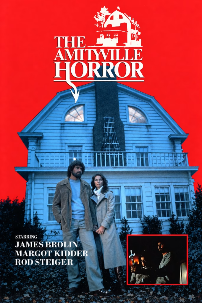
The enormous blue house is the true star of this poster. James Brolin and Margot Kidder stand uneasily before it, while a small inset image of a priest with a crucifix hints at spiritual conflict. The glowing attic windows make the house appear watchful and alive.
2. Composition
The layout is tightly centred around the house’s symmetrical façade and chimney. The title hovers above it like a warning, while the couple stands at the base, visually dwarfed by the building. The small religious inset adds a secondary narrative without disturbing the clear hierarchy.
3. Colour
A saturated red background clashes with the cold blue house, creating immediate visual tension. Red suggests danger, blood and infernal energy; blue gives the house a corpse-like, unnatural chill. The deep black shrubs at the bottom trap the figures inside a dark, threatening setting.
4. Title and Typography
The large white serif title is formal and monumental, as if announcing a famous haunted location rather than merely a film. The illustrated white house above the lettering reinforces the connection between title and setting. Its clean, traditional typography makes the supernatural imagery feel oddly plausible.
5. Symbolism and Tone
The house represents domestic security turned hostile: the family is physically outside it, yet still overshadowed by its power. The priest and crucifix suggest that ordinary human responses may be insufficient against what lives there. The tone is ominous and restrained, promising a serious haunted-house drama rather than a creature feature.
The Amityville Horror (1979): The Family Before the Nightmare
1. Imagery
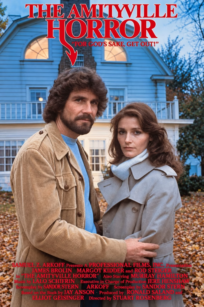
This poster foregrounds George and Kathy Lutz in front of the Amityville house. Their ordinary clothing and serious expressions emphasise the story’s domestic side, while the lit attic windows and looming façade suggest that something is wrong behind them. The image makes the house a quiet but powerful third character.
2. Composition
The couple occupies the centre of the poster, framed by the symmetrical house behind them. Their closeness conveys family unity, but the house’s scale makes them appear vulnerable and trapped within its presence. The title sits directly above, visually pointing down towards the attic and chimney.
3. Colour
Cool blues dominate the building, sky and the woman’s coat, creating a detached, wintry mood. Earthy browns in the man’s jacket and the autumn leaves add realism, while the intense red title introduces danger. This red-blue contrast creates tension without relying on graphic horror imagery.
4. Title and Typography
The title uses traditional red serif lettering, outlined in white for clarity against the pale house. Its most distinctive feature is the long descending tail of the “R,” which points towards the home like an accusation. The tagline, “For God’s sake, get out!”, introduces urgency and religious fear.
5. Symbolism and Tone
The poster turns the familiar ideal of a family home into a source of anxiety. The couple appears grounded and believable, which makes the supernatural threat feel more intrusive. Its tone is restrained and tragic: a haunted-house story presented as the destruction of domestic safety rather than as spectacle.
The Amityville Horror (1979): A Haunted House, a Frightened Couple and Father Delaney
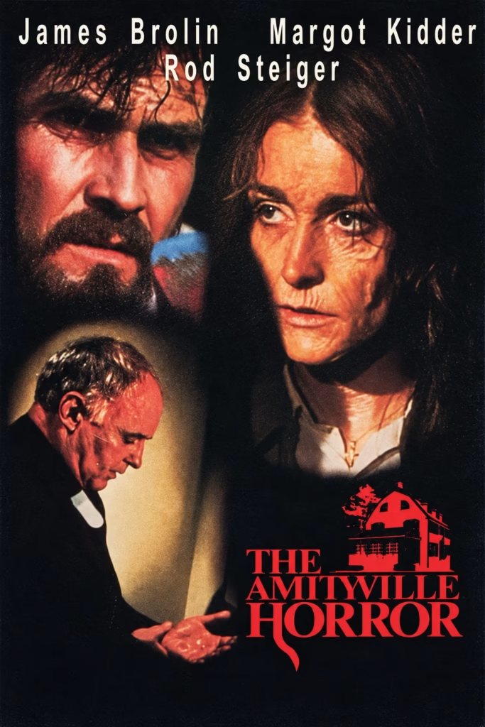
1. Imagery
The poster brings together close-up portraits of James Brolin and Margot Kidder with a smaller image of Rod Steiger, shown leaning forward with his hand extended. The actors’ serious expressions and the shadowy, textured background establish a mood of unease. A red silhouette of the Amityville house appears beside the title, making the location itself part of the film’s identity.
2. Composition
Brolin and Kidder dominate the upper and central areas, their faces close together but looking in different directions. Steiger’s smaller figure occupies the lower left, creating a secondary focal point and adding depth. The title and house graphic anchor the lower right, balancing the portraits and completing the poster’s downward visual flow.
3. Colour
Black and deep brown surround the figures, while warm orange and red light falls across their faces. This high contrast gives the portraits a distressed, almost feverish quality. The vivid red title and house stand out against the darkness, drawing attention to the film’s name and its ominous setting.
4. Title and Typography
The actors’ names run across the top in tall, widely spaced cream lettering. The title uses large red serif capitals, with the house silhouette integrated into the design. Its bold scale and colour make it the poster’s strongest graphic element, while the flame-like stroke beneath “HORROR” adds a dramatic finishing detail.
5. Symbolism and Tone
The house logo suggests that the building is more than a backdrop: it is central to the horror. The portraits, shadowed faces and ominous red imagery make the poster feel psychological and threatening. By placing the principal actors above the title and house, the design links the family’s presence directly to the place at the heart of the story.
The Amityville Horror (1979): A Screaming Face and an Unseen Evil
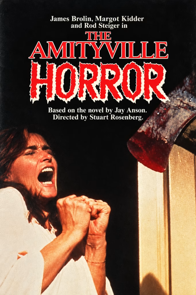
1. Imagery
The poster distils the film into one violent moment: a terrified woman recoiling from a bloody hand emerging through a doorway. The actual threat remains mostly unseen, which makes the image more unsettling. Her clenched hands and open mouth convey panic without needing a full supernatural tableau.
2. Composition
The layout divides the poster into two visual zones. The title and credits dominate the dark upper half, while the woman and intruding hand occupy opposite lower corners. The empty black space between them creates suspense, making the threat feel as though it could emerge from anywhere.
3. Colour
Black provides a deep void around the figures, while the woman’s pale clothing and warm skin tones make her look exposed and vulnerable. Red is reserved for the title and blood, connecting the film’s name directly to danger and violence. The yellow-lit doorway adds an eerie domestic glow.
4. Title and Typography
The title combines two contrasting treatments: The Amityville appears in formal red serif letters, while Horror is rough, torn and blood-red. This contrast mirrors the film’s premise—a respectable home and place name disrupted by something savage. The jagged lettering makes the final word feel almost physically damaged.
5. Symbolism and Tone
The doorway represents an ordinary domestic boundary violated by supernatural evil. The hand is both an attack and an intrusion from the hidden world inside the house. With its single victim and isolated gesture of violence, the poster adopts a direct, frightening tone: intimate terror rather than grand haunted-house spectacle.
The Amityville Horror (1979): A Family Torn Apart
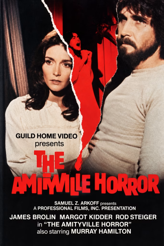
1. Imagery
The design centres on James Brolin and Margot Kidder, divided by a jagged tear that reveals a red, screaming silhouette. The physical tear acts as a violent rupture between the couple, while the shadowy figure inside it suggests the supernatural force tearing through their lives.
2. Composition
The two protagonists occupy opposite sides of the image, their faces turned away from one another. The vertical tear creates the central axis and leads down towards the title. This simple division makes the poster feel fractured and unstable, as though the image itself has been damaged by the haunting.
3. Colour
The palette is reduced to black, cream and blood red. Cream keeps the couple visually grounded and human, while the central red strip introduces panic and violence. The dark background presses in around them, adding a sense of emotional confinement.
4. Title and Typography
The title is set in huge, blunt red letters that echo the colour of the central rupture. Its uneven, heavy forms give it a bold exploitation-horror energy, in contrast with the small, matter-of-fact credit typography. The title becomes part of the threat rather than a neutral label.
5. Symbolism and Tone
The torn surface symbolises a family and home broken open by unseen evil. The screaming figure may be read as an image of possession, panic or buried trauma emerging from within. The tone is urgent and psychological, presenting the story as a violent invasion of intimate domestic life.
The Amityville Horror (1979): Terror Framed as a Memory
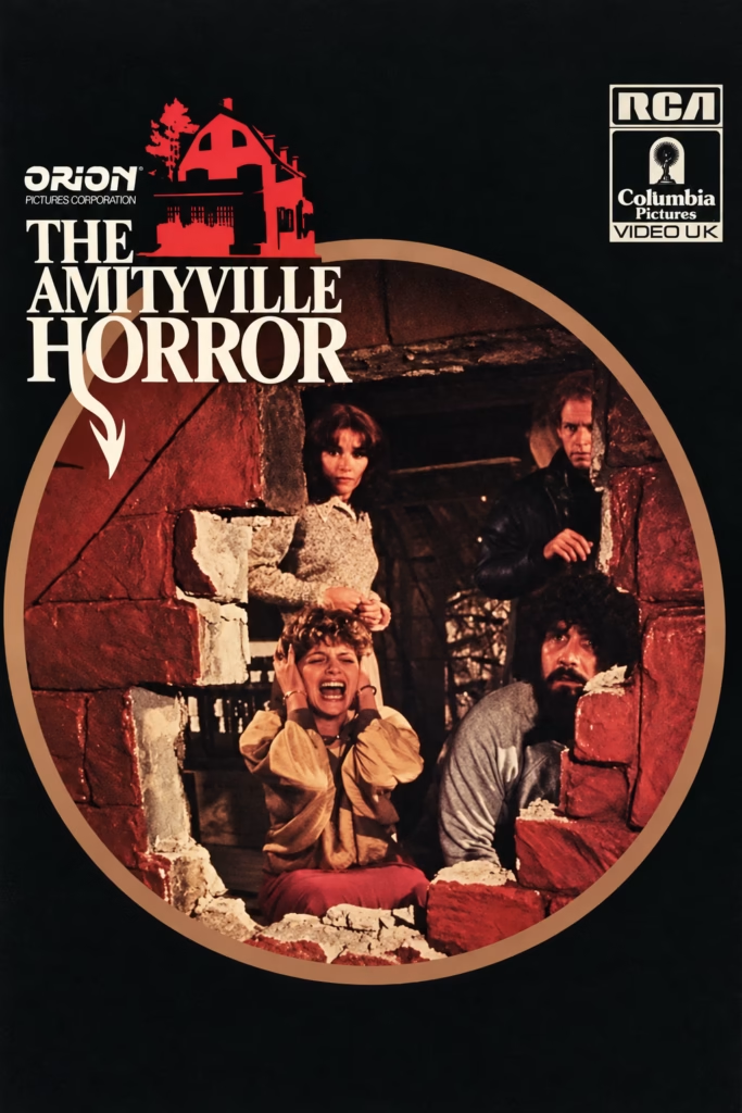
1. Imagery
The poster presents the family’s terror inside a large circular frame: a woman screams amid broken masonry while George Lutz and a priest look on. The image feels like a glimpse into a sealed-off nightmare. The title, house icon and distribution logos surround this scene without interrupting its claustrophobic focus.
2. Composition
The oversized circle dominates the lower two-thirds of the poster, concentrating the action like a lens or peephole. The title occupies the upper-left corner, while the logos balance the upper-right. This asymmetrical layout feels elegant but unsettling, with the circular image suggesting that the viewer is witnessing something trapped and inescapable.
3. Colour
The palette is almost entirely black, cream, dark brown and rusty red. The red house icon and reddish interior lighting connect the title to the violence within the circular image. Cream lettering and the pale ring provide contrast, making the design legible without reducing its oppressive darkness.
4. Title and Typography
The title uses classic white serif lettering, with Horror enlarged and given a dramatic descending tail. Above it, the red house silhouette identifies the location as the source of the threat. The formal typography gives the poster an air of prestige, contrasting with the chaos in the image below.
5. Symbolism and Tone
The circle can be read as a window, a lens or a closed ritual space: the family appears caught inside it. Broken bricks suggest that the home’s structure is collapsing physically and emotionally. The tone is dark and serious, presenting the haunting as a confined domestic nightmare rather than as sensational spectacle.
The Amityville Horror (1979): A House, an Axe and an Unseen Presence
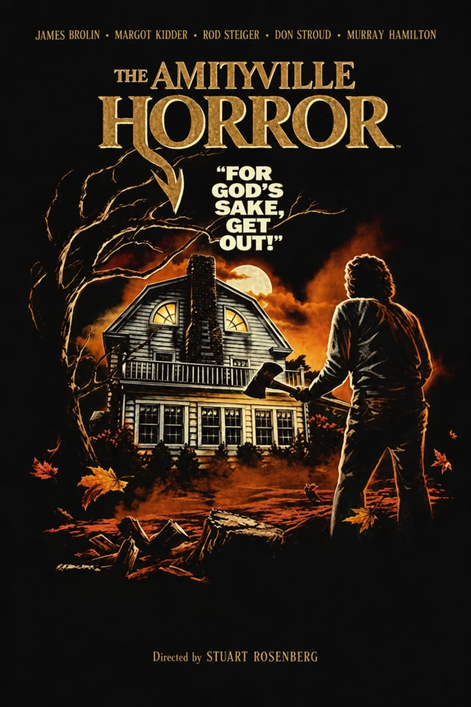
1. Imagery
The illustration turns the Amityville house into a glowing nocturnal target. A lone man approaches with an axe, silhouetted against a stormy orange sky, while claw-like branches curl around the building. The warm windows give the house a disturbing, almost sentient presence.
2. Composition
The poster is organised around a triangular relationship: the title dominates the top, the house occupies the centre, and the axe-carrying figure stands to the right. Bare branches frame the left side and pull the eye inward. This creates a dramatic confrontation between a human intruder and the home itself.
3. Colour
The palette is limited to black, burnished gold, cream and fiery orange. The colours resemble a damaged old photograph illuminated by firelight. Gold gives the typography and house an almost antique authority, while orange introduces violence, autumnal decay and supernatural heat.
4. Title and Typography
The oversized gold serif title has an old-fashioned, prestigious quality, contrasting with the dark, violent imagery below. The tagline—“For God’s sake, get out!”—is sharply stacked in white, creating urgency beneath the logo. The actor names and director credit are restrained and balanced, framing the artwork without competing with it.
5. Symbolism and Tone
The axe suggests domestic violence and loss of control, while the house represents a place that should offer safety but instead appears threatening. The enclosing branches make the scene feel trapped within a curse or nightmare. Its tone is grave and mythic: a haunted-house film presented as an American gothic tragedy